I often encounter comments like “I have no clue how that star thing graph of yours is supposed to tell me!” Like most other things it is not complicated once you know what to look for. Let me try 🙂
This graph type is similar to most other graphs in that the area underneath (or in this case – within) is an indicator of the value represented. From that it follows that in our case the ‘size’ of the individual shapes is a pointer to the amount of rain we had in a year. Should we therefore just look at these two shapes A and B (which are to scale by the way), we can see that based on area alone, that shape B represents a bigger value than that of figure A.

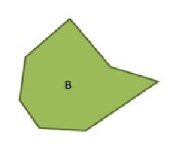
In the case of Highlands’ rain, shape A represents the 30 year average and shape B is the 2006 calendar year. We can therefore deduct that we had a substantially better year in ’06 than the average to be expected. However, if this was all we wanted to do a simple graph like this pie graph would have been easier .

The spatial distribution shape gets stronger when we keep in mind that the year is spread around the shapes in sequence as the months go. Like this:

If we now add shape A back into its monthly context we can see that, with the exception of some rain in February and March, according to the 30 year average, we should actually expect our rain only in the months of October, November and December. 2008 did not have good rain in this area as you can see from the bar graphs. The distribution chart shows how January 2008 was such an abnormal month that despite the weak rainfall in recent months, 2008 as a calendar year was still above average.
I hope the above explains the charts a bit better. Should you still have questions, please feel free to ask me and I will see what I can do.